- Stock up on La Croix.
- Make sure another big project is going on to make things even more challenging
- Make a great website using guidelines we have used in all projects starting last summer as well as quick and efficient design themes.
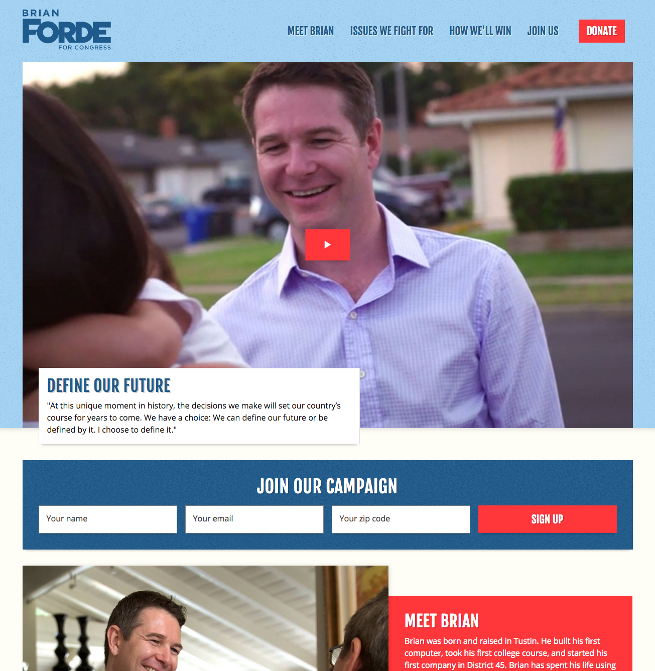
The Client: Brian Forde. Who is Brian Forde you ask? He worked under former President Barack Obama as the Senior Technology Advisor. He helped launch President Obama’s Climate Data Initiative and, as a former practicing meteorologist, I think that is fantastic. He’s running for Congress in southern California and after talking with him, he seems like a good, down to earth guy with a positive message.
The Site: forde.com.
On Friday July 7th, the project began. When I say the project began, my portion of the project began. Brad got contacted by the client a couple days before and agreed on a launch date on July 19th. For those who don’t understand web design, most projects I’ve worked on take about 3 months with more than 2 people doing the design and frontend development work. Brad agreed to do the work with the deadline in mind. As for me, I am currently involved in another big project and thankfully it was in a bit of a lull period from the development side of things, so I agreed to help Brad out. Like with most projects we do anymore, Pattern Lab was the tool of choice. Why use Pattern Lab when we could just crank out everything on the actual site?
- Brad and I do our best and fastest work in Pattern Lab. Mustache is a great thing. Gulp tasks are great things. Build fast; build efficiently.
- Doing your work in Pattern Lab allows you to create pages and templates as well as a pattern library/pattern playground for your client.
- Atomic Design. Brad knows a little bit about that.
- Pattern Lab is where I learned web design. Yes I took codecademy classes and read books to learn too, but getting my hands dirty in Pattern Lab allowed me to fail and learn from my mistakes.
A little nervous of the timeline, I dove into the project with Brad. We cranked out components based on one comp with colors and a few grayscale comps that we received from the client. Did we use these comps? Sort of. Did we use the colors in the one comp? Only for one of the theme options to see what it would look like. Why? Because every site we make we care about the identity of the client and, frankly, the colors in one of the comps weren’t working for what we wanted to build him and how the public would perceive him solely from the website design.
We built a collection of components in Pattern Lab and the general IA (example of it below included between a header and footer) of what content should go where. Grayscale components nonetheless, but these grayscale components are the foundation of iterative workflow. These would change a bit over time and that is okay. Our process starts with building the foundation. Then we add styles. Iterate. Massage styles. Iterate. Massage. It’s a great workflow, and it all happens within code, making it easier to get the ball rolling and easier to import into the actual site.

The Design
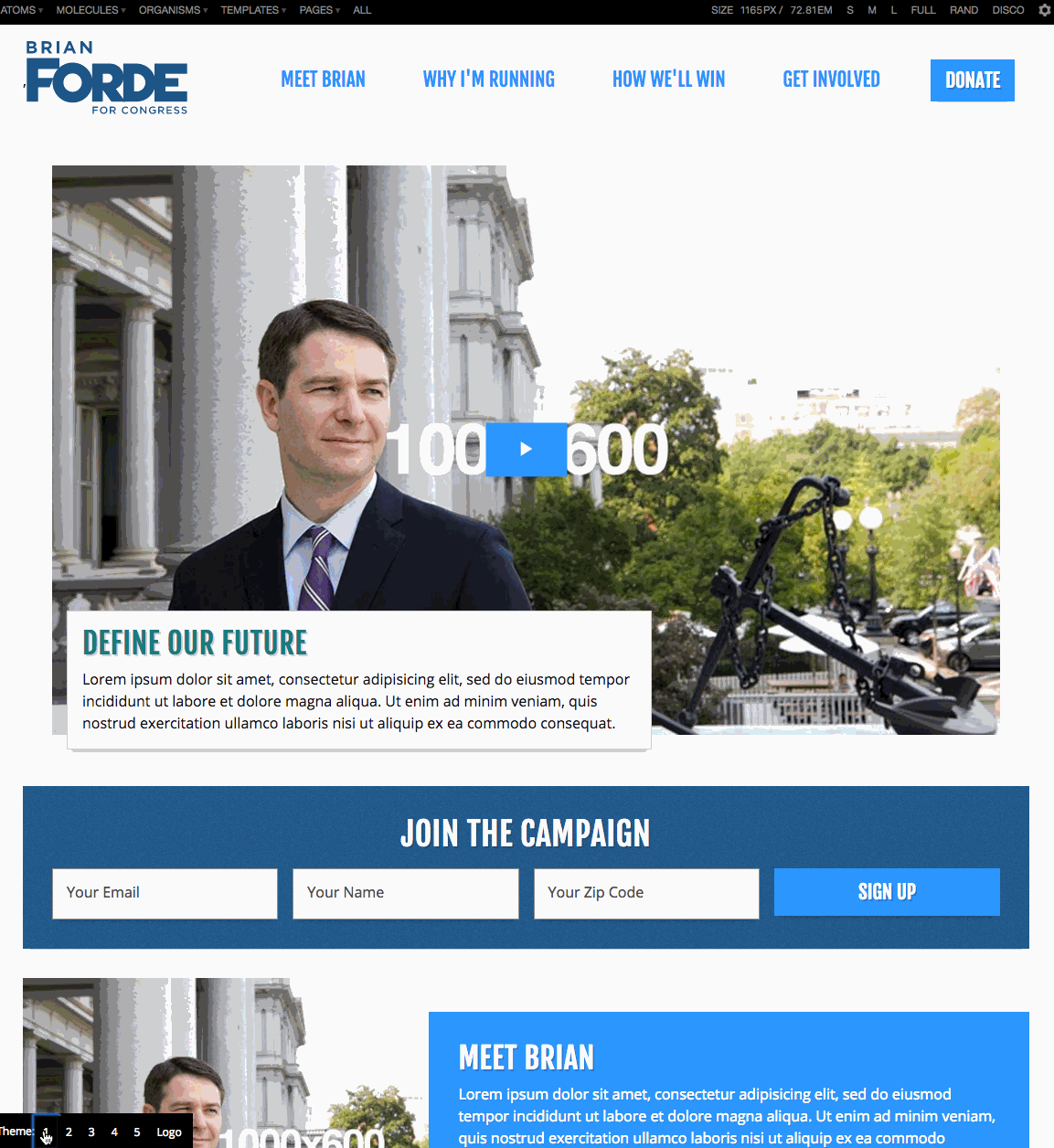
We now had the components and some sort of wireframes set up in PL. We needed a design direction quick. Brad set up a short 20-second gut test of sites for Brian’s team to look at and react to. I took notes on their reactions, especially Brian’s. After that we had an idea of some of the key desires they were looking for in their website. Bright colors, strong calls to actions, clear forms, as well as other points. We had their input. We just needed the design direction, which brings me to my favorite part of this project: building a theme and logo switcher with Brad. How did we do that? 6 buttons (5 themes and a logo button), some JavaScript, and two-tiered Sass variables that could be overridden depending on the 5 separate theme-CSS files we activated. We built it out, chose some color schemes, called the Brian Forde For Congress team. We were able to switch through different colors, fonts, etc. with the click of a button and we were able to switch through some of the logo designs they had sent over. I recreated the process below (obviously we used actual logos and font-sizes were better executed during the meeting, but you get the idea). Brian was fortunately sold on the one theme and we had an art direction in a half hour meeting.
Bringing It All Together
Grayscale components. Check. Art direction. Check. The good part about the theme changer was that I could kill all the other themes and implement the theme they chose right into our Sass variables. Quick and easy. We replaced the placeholder blocks in the wireframes with actual components. We used CSS Grid Layout and Flexbox for layout-specific elements, making this the first project we used CSS Grid Layout on. I have never used floats in a project (aside from a text passage image), which shows how new I am to the web design game. For someone who is progressive like Brian and former Senior Technology Advisor in the White House, it only made sense to use the latest and greatest in CSS. The pages in Pattern Lab looked good enough to start implementing into a CMS.
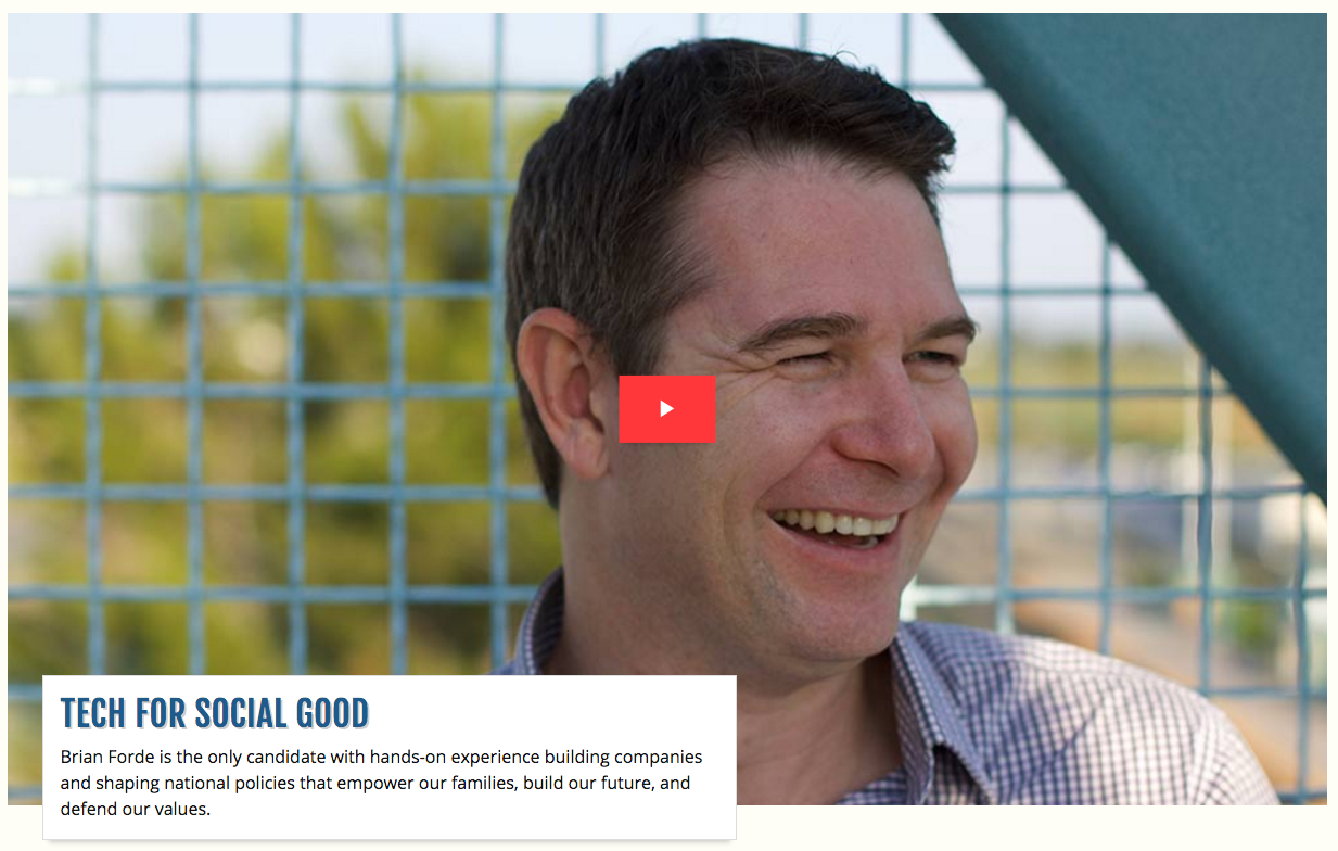
After many iterations, this grayscale hero component…

would eventually become…
Building the Actual Site
The great thing about Pattern Lab is it all renders as HTML, CSS, and JS. The other great thing is while we built patterns in Pattern Lab, we could copy some of the key patterns into the Jekyll site, the CMS that would be used to spin up the website. Why did we use Jekyll instead of WordPress? Mainly time. Jekyll spins up static sites quickly and easily, and that’s what we needed with the website MVP. Is WordPress easier to use from a content management standpoint? Probably, but it is much slower to build out components and pages for a project consisting of mostly static pages anyways with only a little bit of functionality.
Most of the production work took place in Pattern Lab. Once the pages were built, we took some of the organisms (aka more complex components) and manually copied them over into the Jekyll site’s includes folder. This way we could include the same pattern on multiple pages. We built out the templates from Pattern Lab in the layouts folder of the Jekyll site. We managed the content of the pages within markdown files located at the root of the Jekyll site. With some help from the liquid templating language and some placeholder content, we were able to scaffold out the site. We would use Pattern Lab to massage the CSS further (adding box shadows, background bands, and spacing to add dimension). I then added a gulp task to copy over the CSS, images, icons, and JavaScript from Pattern Lab into the Jekyll site. All looked good in Chrome. But Safari, Firefox, and the dreaded IE/Edge were next to test.
Testing and Finishing Touches
Brad did the majority of the IE/Edge testing. I took on a bit of the small screen tweaks as well as Safari and Firefox testing. We included fallback CSS so browsers that don’t support CSS Grid Layout would look solid, but there were still some tweaks with the forms and other grid items. He realized that there needed to be wrappers around items within a grid component for them to render properly in IE/Edge. All the bugs were fixed. We had a site built! A day was left until the potential soft launch. Hoor…oh no…icons. IE/Edge does not like external source SVGs for some reason. We used a script called svg4everybody but that wasn’t working. Brad spent hours on it. We slept on it (sort of). I came in the next day and had to use my own personal site to test the SVG icons being included within the project. I ended up changing the script in the head to the one we included in another project. Refresh. Voila! Icons were showing up! We jumped for joy when we saw this. Were we done? Not yet. Brian and his team had to replace our placeholder content in markdown within Jekyll and we had a few content additions and design tweaks. By Wednesday afternoon, we finally finished the MVP site. Wednesday evening we launched the site with their team. Finally we could say, “Hooray!” I am hoping that all of the hard work we put into this project so far leads to a win for Brian.