Us: “What are you using to build your site?”
Client: “React.”
Us: “Why are you using React?”
Client: “…because it is the hot thing.”
This is something that we have heard from clients before. It’s a good question to ask because it gives us an idea of what we may need to help build and it allows the client to really think of why they are using the technology they are using to build their site.
Note to clients, contractors, and consultants: what you are building your website in now will likely change over the coming years. Always keep that in mind.
The first few design systems I helped build were in regular old HTML, CSS, and JavaScript with a templating language like Mustache to help with loops and API hooks. Since then it has transitioned to React, Web Components (Custom Elements), and Angular. In many cases, our clients have multiple frameworks they build their sites with. That includes a potential client, where I built the top of their homepage in React, Angular and Vue in less than 18 hours (over a couple days) before showing them the prototype. I never built anything in Angular or Vue, but I am used to getting thrown into the fire to learn things. The idea was to normalize component structure and styles across frameworks to demo how we could accomplish a design system that supports multiple frameworks.
One thing to note is that I am a front end developer. I’m focusing more on styling and structure in this post rather than JS APIs, npm publishing, and all of that fun stuff. Now that you know that, let’s dig in.
The components
Because the goal is to build a design system that spans across frameworks, we needed to build out components. You would think that this is a given in any large organization’s web development, but you’d be surprised (or not) how many organizations still don’t use reusable components in 2021.
Which out of the 3 frameworks am I most familiar with? React. Alright, lets’ create a new Storybook because that’s what I’ve used before and it’s a great tool.
Cool, npm installed 20 billion node modules. We are ready to go.
Storybook includes a couple of basic components in the initial installation (I think it’s a button and a header component). It also includes a sample page that we can modify for our own prototype.
What components are on the client’s homepage? Header and a button. Good we can refactor the ones Storybook provides to work. I see a hero, and a section with other content inside. Within the header, there’s the logo, primary nav, utility nav. Should be responsive, so let’s make sure that a menu button is locked into the header to show up on small screens. I know, React allows you to render an entirely different views depending on screen size, but let’s use simple CSS to do that. Let’s focus on the top of the page for now. Let’s add a styleguide-only.css file that contains an .fpo class that we can use to stub out some generic blocks on the page without affecting the actual library. Let’s do this on the page that Storybook provided out of the box. This looks something like this:
// Homepage.js page in React Storybook

import React, { Component } from 'react';

export class MyHomepage extends Component {

  render() {
    return (
      <body>
        <div class="fpo">
          <div>Header</div>
          <div class="fpo">Logo</div>
          <div class="fpo">Primary Nav</div>
          <div class="fpo">Utility Nav</div>
        </div>
        <div class="fpo">Hero with title, description, and button</div>
        <div class="fpo">
          <div>Section with title</div>
          <div className='fpo'>List of cards</div>
        </div>
        <div class="fpo">
          <div>Section with title</div>
          <div className='fpo'>List of cards</div>
        </div>
      </body>
    );
  }
}
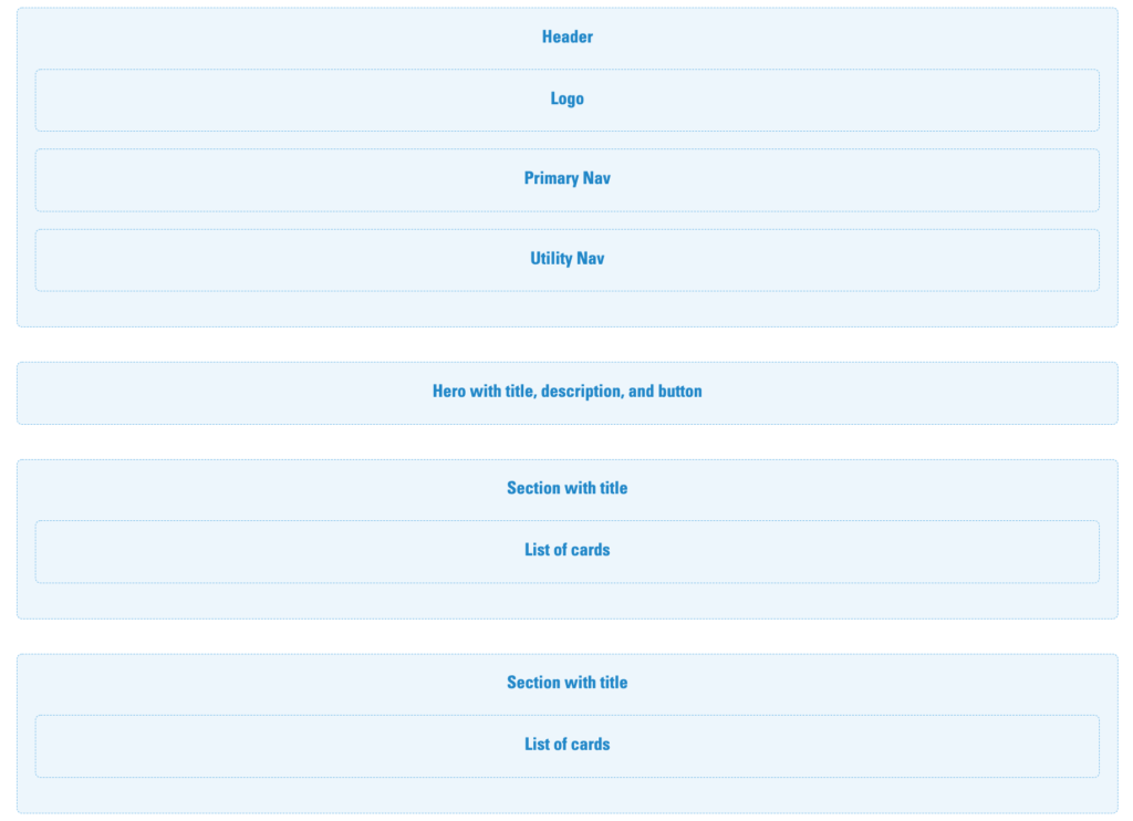
That’s a good start. Looks beautiful, right? No? But at least we have the wireframe to start creating components to replace these FPO blocks with the actual living, breathing components. The thing to keep in mind while building components: your CSS structure and HTML structure is extremely important when it comes to portability across frameworks. I feel like CSS gets thrown to the side for a lot of developers and I don’t want that to happen here. Alright, let me close my eyes and point to a part of the screen to choose my component: Hero. There it is. Let’s build the hero component.
CnHero.js component in the React library:
// CnHero.js in React

import React from 'react';
import PropTypes from 'prop-types';
import CnLayoutContainer from '../CnLayoutContainer';

function CnHero(props) {
  const { imgSrc, imgAlt, title, children, ...other } = props;

  return (
    <div className='cn-c-hero' {...other}>
      <img className='cn-c-hero__img' src={imgSrc} alt={imgAlt} />
      <div className='cn-c-hero__inner'>
        <CnLayoutContainer className='cn-c-hero__layout-container'>
          <div className='cn-c-hero__body'>
            <h2 className='cn-c-hero__title'>{title}</h2>
            <div className='cn-c-hero__description'>{children}</div>
          </div>
        </CnLayoutContainer>
      </div>
    </div>
  );
}

CnHero.propTypes = {
  /**
   * Child node(s) that can be nested inside component. The Hero child nodes will appear below the hero title
   */
  children: PropTypes.node,
  /**
   * Hero image alt text
   */
  imgAlt: PropTypes.string.isRequired,
  /**
   * Path to hero image
   */
  imgSrc: PropTypes.string.isRequired,
  /**
   * Hero heading title text
   */
  title: PropTypes.string
};

export default CnHero;
There we go. There’s our hero. We have an image, title, and some other stuff that we can throw inside like a passage of text or a button, which we will need in this case.
Why is there a “Cn” in front of everything? This stands for “Company Name” since it is a vanilla demo that I can steal from for future projects if I need to. This can also be the design system name you and your team come up with. You technically don’t need this in React, but we’re trying to be consistent across platforms. With Vue and Angular, it’s dash case for the API with the company name as the first part of that file name (e.g. cn-hero). We want consistency across these platforms and want to export the component with “Cn” in front of “Hero”. You’ll also see CnLayoutContainer, which is basically a container I already built in React to cap the content width and center it on larger screens. In this context, it will help align the content of the hero with the rest of the content on the page while allowing the hero image to go full bleed.
Along with the Cn prefix, we want to be consistent with API structure. The last thing we want to do is use heroTitle for the hero component, then pageHeaderTitle for the page header title, and so on, making it a headache for users of the design system. Use title or whatever variable name you want to use for titles across the board. This goes a long way and prevents a user of the design system from having to constantly look at documentation. It’s more intuitive. Use url or href for all URLs, items for arrays, and anything else. I also try to do that with functions across components where (e.g. handleOnClick()). The more time we take to think about this now, the less headaches later.
You’ll also notice that I’m using BEM syntax for the class names. After around 5 years of writing our code this way, we haven’t strayed from it since (with some minor improvements project after project). It may seem like it is overkill and verbose, but it helps a user of the design system understand what each element of the component is there to represent. It also helps new developers of the design system learn faster and keeps the all-important structure needed for portability. It’s good to document all of these guidelines if you are starting to build a design system.
Below is the hero component’s SCSS.
// CnHero.scss

@import "../../../css/abstracts/_variables.scss";
@import "../../../css/abstracts/_mixins.scss";

/*------------------------------------*\
    #HERO
\*------------------------------------*/

/**
 * 1) A hero is a pronounced block typically situated at the top of a page layout
 */
.cn-c-hero {
  position: relative;
}

/**
 * Hero image
 */
.cn-c-hero__img {
  display: block;
  width: 100%;
  height: 24rem;
  object-fit: cover;

  @media all and (min-width: $bp-small) {
    height: 36rem;
  }
}

.cn-c-hero__inner {
  position: absolute;
  bottom: 0;
  z-index: 2;
  padding-top: 2rem;
  padding-bottom: 2rem;
  background: linear-gradient(to right, rgba(0, 0, 0, 0.75) 3%, transparent), linear-gradient(to left, rgba(0, 0, 0, 0.75) 5%, transparent);

  @media all and (min-width: $bp-med) {
    top: 0;
    right: 0;
    bottom: 0;
    left: 0;
    padding-bottom: 0;
  }
}

/**
 * Hero layout container
 * 1) Instance of LayoutContainer that sets left gutter
 */
.cn-c-hero__layout-container {
  display: flex;
  align-items: center;
  position: relative;
  width: 100%;
  height: 100%;
}

/**
 * Hero body
 * 1) Contains the hero text, call to action, and other things
 */
.cn-c-hero__body {
  color: $color-neutral-white;

  @media all and (min-width: $bp-med) {
    position: relative;
    bottom: 2rem;
    max-width: 50%;
  }
}

/**
 * Hero title
 * 1) Note: this typography needs to be addressed at a system level
 */
.cn-c-hero__title {
  @include reset;
  @include typography-preset-1--bold;
  text-transform: uppercase;
  margin-bottom: 1rem;
}

/**
 * Hero description
 * 1) Note: this typography needs to be addressed at a system level
 */
.cn-c-hero__description {
  @include typography-preset-4;

  .cn-c-text-passage {
    margin-bottom: 2rem; /* 1 */
  }
}
You may ask, “Why do some properties use variables and mixins while others don’t?” The short answer is that this is a demo for a potential client and the goal is to show them the value of portability across frameworks, not implementing a theming structure. If it was about building a proper theming structure, we’d create a tiered theming system using Sass variables or CSS custom properties and possibly something like Salesforce’s Theo to allow designers and developers to collaborate on the design tokens. Not surprisingly, Brad has written about our experiences with theming and we’ve even built on this since. For this prototype, though, it’s about getting a solid CSS ruleset structure, but the details within the properties aren’t as important at this point.
A few takeaways so far from the way I have structured the HTML, CSS, and API:
- Prefixes are helpful for the users of the design system to know that the code is coming from the design system. It helps separate design system code from the product code.
- APIs matter. Use variables that are self explanatory. If you’re using
textfor button text, use it in the badge too. Don’t make it harder on a user of the system if we can prevent that. - BEM syntax is verbose, but it allows for easier learning from newly onboarded developers using or developing the design system. “Oh, this is the accordion title text and not just a random
h3thrown into the accordion panel.” - Comment your code in an organized fashion. We’ve used a lot of what Harry Roberts talks about in his CSS guidelines. It helps with returning to your code in the future or another developer looking at it down the road. Like documentation, it is important.
So there you have it. We have a hero component built out with an HTML structure, API, and styles. Now we rip out the Hero FPO block from the page we stubbed out earlier and replace it with the hero component. Then we rinse and repeat with the rest of the components and iterate over styles and APIs until we have our finished product for React.
Where do we go from here (now that all other children are growin’ up)?
So we have what we need built in React. Great! However, we still have 2 frameworks to go: Angular and Vue. Two frameworks I have never developed in before, but when you learn one of these frameworks, they tend to all function similarly from a front end standpoint. So we basically have to rebuild every single component from the ground up. This is going to take a while…or is it?
The good news about the front end of the web is that it all runs on HTML, CSS, and JavaScript. For demonstration purposes, we don’t need to worry much about Javascript right now. Therefore, we can first use the good old copy and paste method to copy the HTML from each component in the React project to the component .html file within a new Angular Storybook and the .vue file within a new Vue Storybook. Let’s do that and update the APIs or syntax accordiongly:
CnHero.vue file within the Vue component library:
// CnHero.vue in Vue library

<template>
  <div :class="classes">
    <img class="cn-c-hero__img" :src="imgSrc" :alt="imgAlt" />
    <div class="cn-c-hero__inner">
      <cn-layout-container class="cn-c-hero__layout-container">
        <div class="cn-c-hero__body">
          <h2 class="cn-c-hero__title">{{ title }}</h2>
            <div class="cn-c-hero__description">
              <slot></slot>
            </div>
        </div>
      </cn-layout-container>
    </div>
  </div>
</template>

<script>
import CnLayoutContainer from "../LayoutContainer/LayoutContainer.vue";

export default {
  name: "cn-hero",

  props: {
    imgSrc: {
      type: String,
    },
    imgAlt: {
      type: String,
    },
    title: {
      type: String,
    },
  },

  components: {
    CnLayoutContainer,
  },
  computed: {
    classes() {
      return {
        "cn-c-hero": true,
      };
    },
  },
};
</script>
cn-hero.html file within the Angular component library:
// cn-hero.html in Angular library

<div class="cn-c-hero">
  <img class="cn-c-hero__img" src="{{ imgSrc }}" alt="{{ imgAlt }}" />
  <div class="cn-c-hero__inner">
    <cn-layout-container class="cn-c-hero__layout-container">
      <div class="cn-c-hero__body">
        <h2 class="cn-c-hero__title">{{ title }}</h2>
        <div class="cn-c-hero__description"><ng-content></ng-content></div>
      </div>
    </cn-layout-container>
  </div>
</div>
From there you can compile a cn-design-system.css file from the individual component .scss files to port over to both Angular and Vue and use at face value and import that file into the project. I actually created the cn-design-system.css file in the Vue project, and copied it over to the React and Angular project, so it doesn’t really matter where you generate that distributed CSS file. Once you have copied and pasted over the HTML, reformatted the API syntax to match that of Angular and Vue (keep the same names as React for consistency and portability), and copied the CSS over you should have the same components across all 3 platforms. Construct the page with the same components built in React in Vue and Angular syntax, and you should get 3 pages that look the same.
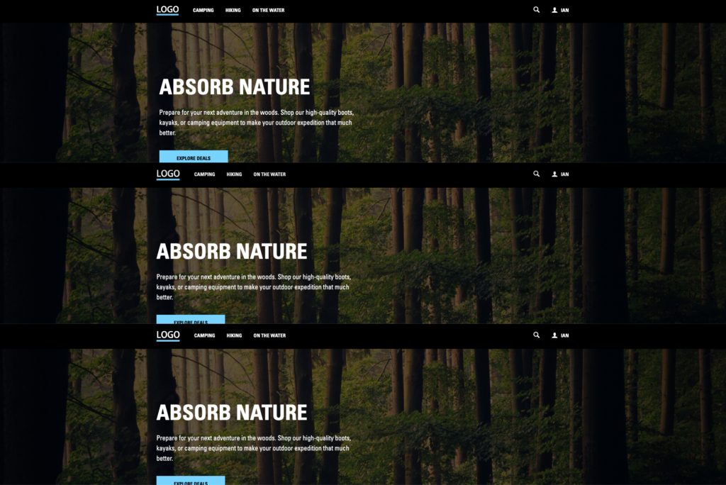
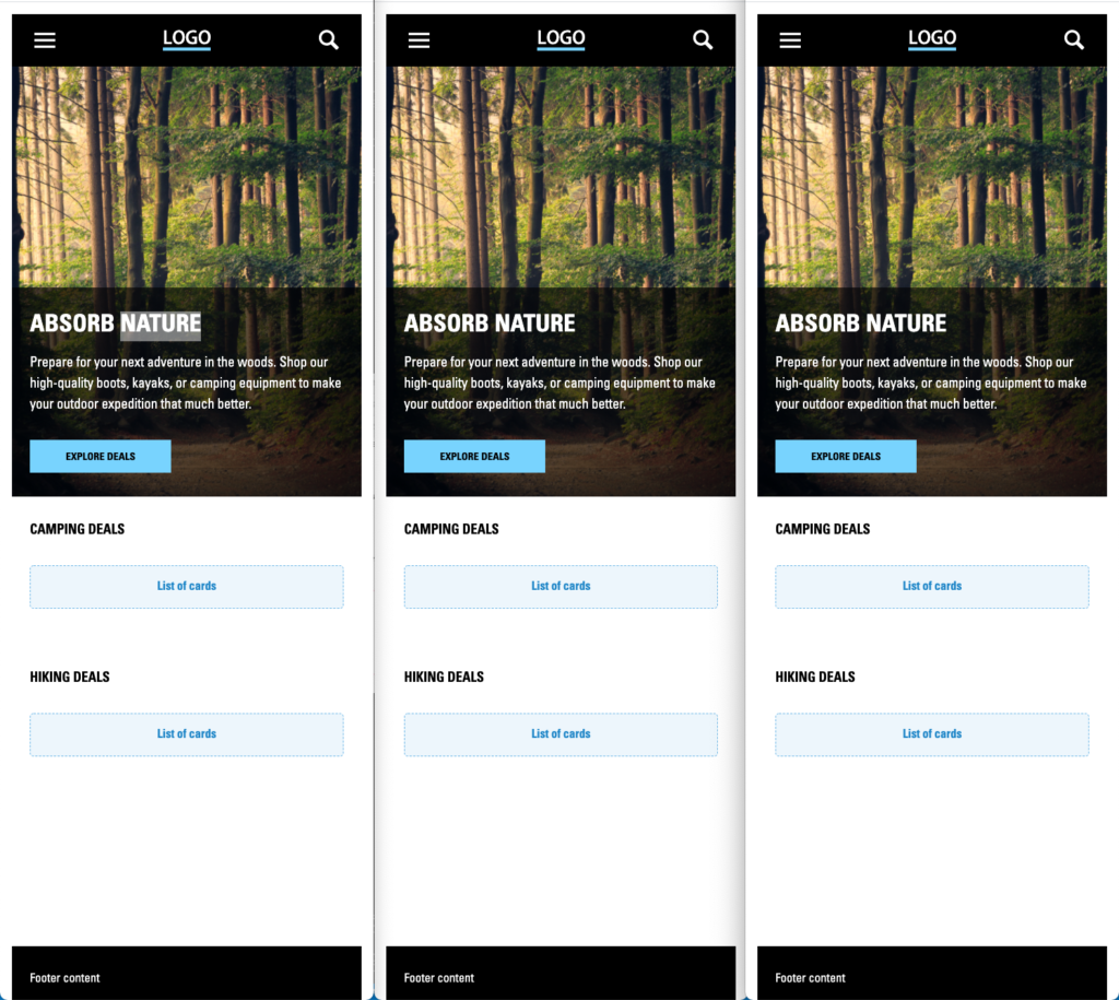
I also made the page responsive because some clients really focus on their site needs to work on mobile (as well as all screen sizes above a certain threshold).
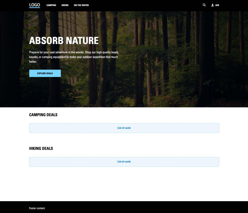
Here is the actual code of the same page built out in Angular, React, and Vue. Notice how the API variables are the exact same, the naming structure of each component is essentially the same (e.g. CnHero in React, cn-hero in Angular, and cn-hero in Vue), and the composition of the page are the exact same. This is where HTML, CSS, and API structure are so important for portability and efficiency across platforms. You may also ask, “Why don’t you have any nav item props in the header?” Once again this is a demo quickly put together, but my header component is usually a container with slots that you can throw different content into to create different recipes of headers (e.g. add a global nav above the main section of the header or reordering the primary nav and logo). This is a quick and dirty way while also knowing that you will be iterating over these patterns in the future if we get the work.
Angular composition of the homepage:
// Homepage.html in Angular

<body>
  <cn-header></cn-header>
  <cn-main>
    <cn-hero
      imgSrc="https://images.unsplash.com/photo-1441974231531-c6227db76b6e?ixid=MXwxMjA3fDB8MHxwaG90by1wYWdlfHx8fGVufDB8fHw%3D&ixlib=rb-1.2.1&auto=format&fit=crop&w=2560&q=80"
      imgAlt="Woods"
      title="Absorb Nature"
    >
      <cn-text-passage>
        Prepare for your next adventure in the woods. Shop our high-quality
        boots, kayaks, or camping equipment to make your outdoor expedition that
        much better.
      </cn-text-passage>
      <cn-button text="Explore Deals"></cn-button>
    </cn-hero>
    <cn-layout-container>
      <cn-section title="Camping deals">
        <div class="fpo">List of cards</div>
      </cn-section>
      <cn-section title="Hiking deals">
        <div class="fpo">List of cards</div>
      </cn-section>
    </cn-layout-container>
  </cn-main>
  <cn-footer>Footer content</cn-footer>
</body>
React composition of the homepage:
// Homepage.js in React

import React, { Component } from 'react';
import {
  CnMain,
  CnHeader,
  CnFooter,
  CnHero,
  CnTextPassage,
  CnSection,
  CnButton,
  CnLayoutContainer
} from 'design-system-name';

export class Homepage extends Component {
  constructor(props) {
    super(props);
  }

  render() {
    return (
      <body>
        <CnHeader />
        <CnMain>
          <CnHero
            imgSrc='https://images.unsplash.com/photo-1441974231531-c6227db76b6e?ixid=MXwxMjA3fDB8MHxwaG90by1wYWdlfHx8fGVufDB8fHw%3D&ixlib=rb-1.2.1&auto=format&fit=crop&w=2560&q=80'
            imgAlt='Woods'
            title='Absorb Nature'
          >
            <CnTextPassage>
            Prepare for your next adventure in the woods. Shop our high-quality boots, kayaks, or camping equipment to make your outdoor expedition that much better.

            </CnTextPassage>
            <CnButton text='Explore Deals' />
          </CnHero>
          <CnLayoutContainer>
            <CnSection title='Camping deals'>
              <div className='fpo'>List of cards</div>
            </CnSection>
            <CnSection title='Hiking Deals'>
              <div className='fpo'>List of cards</div>
            </CnSection>
          </CnLayoutContainer>
        </CnMain>
        <CnFooter>Footer content</CnFooter>
      </body>
    );
  }
}
Vue composition of the homepage:
// Homepage.vue in Vue

<template>
  <body>
    <cn-header></cn-header>
    <cn-main>
      <cn-hero
        imgSrc="https://images.unsplash.com/photo-1441974231531-c6227db76b6e?ixid=MXwxMjA3fDB8MHxwaG90by1wYWdlfHx8fGVufDB8fHw%3D&ixlib=rb-1.2.1&auto=format&fit=crop&w=2560&q=80"
        imgAlt="Woods"
        title="Absorb Nature"
      >
        <cn-text-passage>
          Prepare for your next adventure in the woods. Shop our high-quality boots, kayaks, or camping equipment to make your outdoor expedition that much better.
        </cn-text-passage>
        <cn-button text="Explore Deals"></cn-button>
      </cn-hero>
      <cn-layout-container>
        <cn-section title="Camping deals">
          <div class="fpo">List of cards</div>
        </cn-section>
        <cn-section title="Hiking deals">
          <div class="fpo">List of cards</div>
        </cn-section>
      </cn-layout-container>
    </cn-main>
    <cn-footer>Footer content</cn-footer>
  </body>
</template>

<script>
  import CnHeader from "../components/Header/Header.vue";
  import CnMain from "../components/Main/Main.vue";
  import CnHero from "../components/Hero/Hero.vue";
  import CnButton from "../components/Button/Button.vue";
  import CnSection from "../components/Section/Section.vue";
  import CnTextPassage from "../components/TextPassage/TextPassage.vue";
  import CnFooter from "../components/Footer/Footer.vue";
  import CnLayoutContainer from "../components/LayoutContainer/LayoutContainer.vue";

  export default {
    name: "my-page",

    components: {
      CnHeader,
      CnMain,
      CnHero,
      CnButton,
      CnSection,
      CnTextPassage,
      CnFooter,
      CnLayoutContainer,
    },

    props: {
      user: {
        type: Object,
      },
    },
  };
</script>
There you have it…sort of. React and Vue worked seamlessly with 1 stylesheet. There are some obstacles that I had to climb in Angular to get all of the styles working properly, however. I’ll discuss this below.
Obstacles and Questions
I’m sure going through this you have thought about your own projects and have questions. So here are a few questions and issues I ran into:
- Angular causes some issues when it comes to styling certain parts of a component.
Because Angular is similar to Web Components (Custom Elements), it creates a wrapper around each component’s HTML that you wrote (e.g. <cn-hero>). There are certain things like margin-left: auto or the order property within a flexbox layout and some children of components that can get thrown off by these wrappers compared to React and Vue rendering only the HTML that you wrote. CSS Grid grid-gap and the flexbox gap property have helped, but a cn-design-system-angular-helper.css file had to be created in the Angular storybook to fix the layout issues. It was only a handful of wrapper selectors that I needed to target, so it wasn’t too tedious. Definitely one con about writing code in Angular compared to Vue and React in my opinion.
- Well we have a larger team of design system developers working on this. We all write code differently. How is this possible?
Document this. Set up code guidelines. Once again, Brad has created a good front end guideline questionnaire to help start this. Without any sort of direction, your developers are going to write code inconsistently. Also, governance of 3 frameworks in a design system over time may prove to be difficult. It’s worth talking to your organization about maybe trying to choose 1 or 2 frameworks to support and deprecate the other framework eventually.
- What about turning encapsulation (shadow) on to keep component CSS from being affected by outside influences (e.g. other components or product code)?
This is a good question. My short answer is that if you write good CSS with classes for each component, you won’t need this. Another thing is that shadow and encapsulation also allows for bad CSS practices. Lots of generic tag selectors in CSS that can’t be ported over to a vanilla HTML, CSS, and JavaScript project without being rewritten once React isn’t the hotness anymore. Finally, the “cascade” part of CSS is pretty much removed when you encapsulate CSS files. While you can import the files needed for the encapsulated styles, it just adds more work in my opinion. While CSS custom properties (CSS variables) can help with this, I still have run into issues and frustration when building components in a Web Components (Custom Elements) project before. We have run into issues with product code affecting design system code before, but it was because base styles were way too specific in the product.
- So you’re saying I can’t bundle component SCSS files and import those into the project? It has to be 1 design system CSS file?
No, I’m not saying that you can’t do that. I structure the component’s Vue file, Storybook story file, and SCSS file within the same component folder in my own work. If you have a way to only include the component CSS you are using on a page of your site then go for it. You need to create that tree shaking process and likely include something like a Sass loader to include only the button SCSS for example. I was just saying that you should allow CSS to cascade.
- Why not automate this?
Go for it. If you love webpack and CLIs, have at it. I only had a short amount of time before we presented all of this, so I didn’t focus on this aspect of it.
- What about JavaScript?
I’ll admit that I’m much stronger in HTML and CSS than JavaScript. From what I have seen, most of these platforms use properties that can be set to a functions or callbacks. There’s likely a way to reuse these functions by keeping the naming conventions the same across platforms. However, there is nuance between passing a function down from parent to child in React and using the @Output decorator in Angular. I’d have to dive into this more to see how these relate since I have not built anything in React or Vue before.
- What about CSS-in-JS?
Please don’t use this. While I have used inline styles for setting height to an accordion panel once opened since smoothly animating an accordion of various heights and sizes can prove to be difficult in only SCSS. CSS is a part of web development for a reason. If you can take the time to learn React, you can take the time to learn how to write solid CSS. I’m sure other developers have strong opinions, so here is mine.
So what framework wins?
This is really just me stating my opinion. I would choose React and Vue over Angular. Not having a wrapper component around the HTML that you write within each framework helps. I also feel like it is easier to pass down props from parent to child and passing in functions from the product itself on something like a click event. If you write your CSS and HTML in this well-structured modular way though, the users of your design system will win and your future self will thank you when you don’t have to refactor a bunch of CSS-in-JS or generic h2 tags when React, Angular, and Vue aren’t the hottest things. It has worked for us and I hope it works for you.
I hope this helps you out with your design system planning and development. That is all!