Two of the hottest things in web design and design systems: React and InVision’s Design System Manager (DSM).

Separately these are cool, but what if we combine the two? Storybook is a tool used to organize React components into a pattern library. DSM is a tool that helps design and dev collaboration by syncing up Sketch and actual code with the styles and tokens used to create awesome websites and design systems.
Setting Up Storybook
To start off we need Storybook. We like to set up our project directory to look like this:
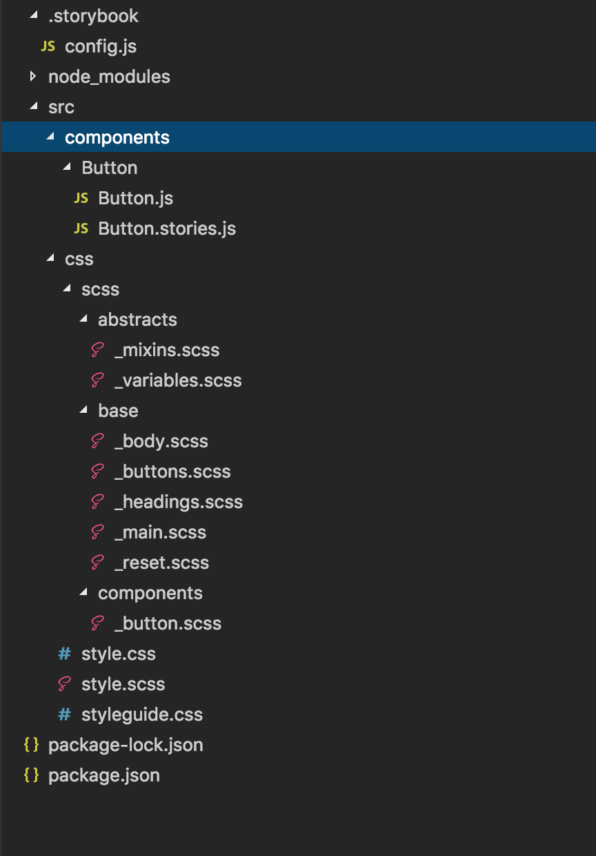
There are various ways to set up your directories, so use a structure that makes the most sense to you. When I run npm run storybook, my project builds and should look something like this:
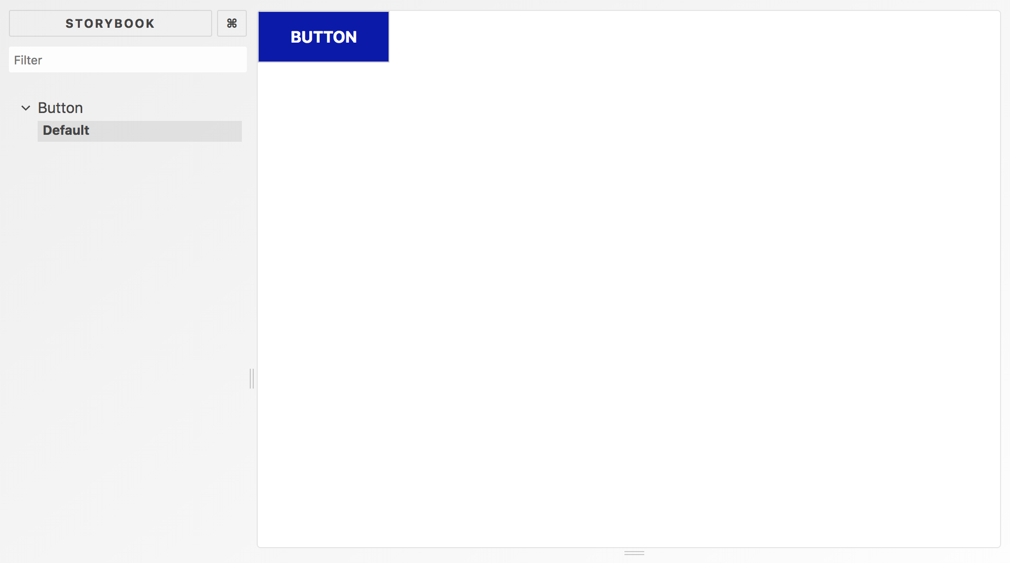
Hooray! We have a storybook project created. Next, we will take a look at creating a DSM library.
Setting Up DSM
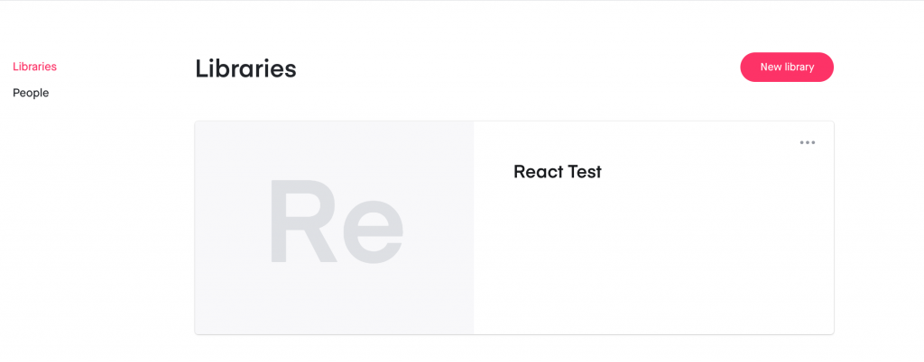
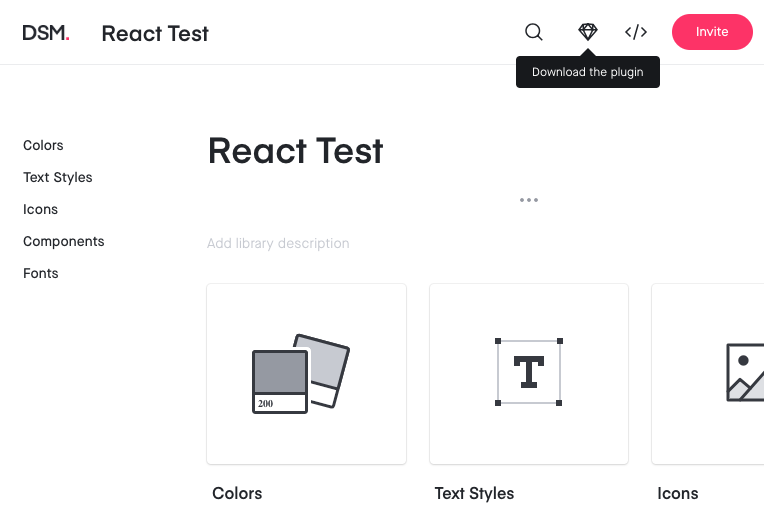
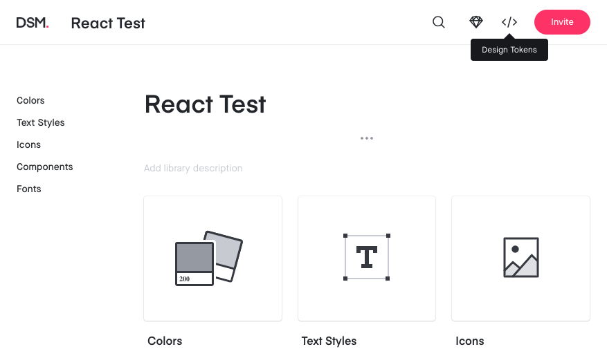
Now time to create a DSM project. Go to the DSM login page and sign in or sign up. Once signed in, go to the DSM tab at the top of the page. It should take you to a page that looks like this (with a Sample Library instead of React Test).
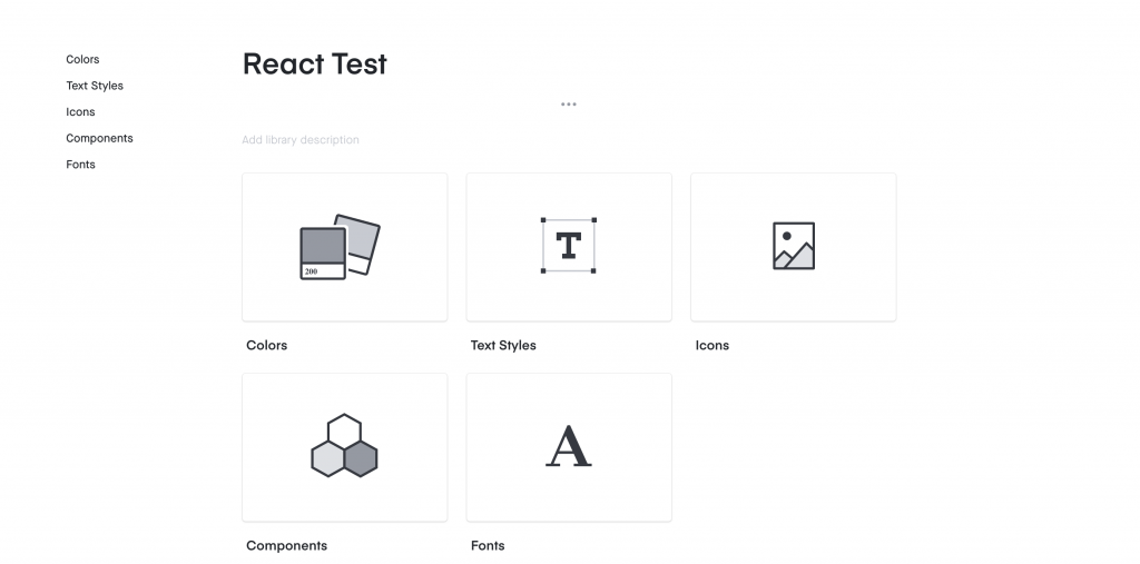
You can either use the current library or create your own empty project. Once you dive into the project, you’ll see several tiles like below:
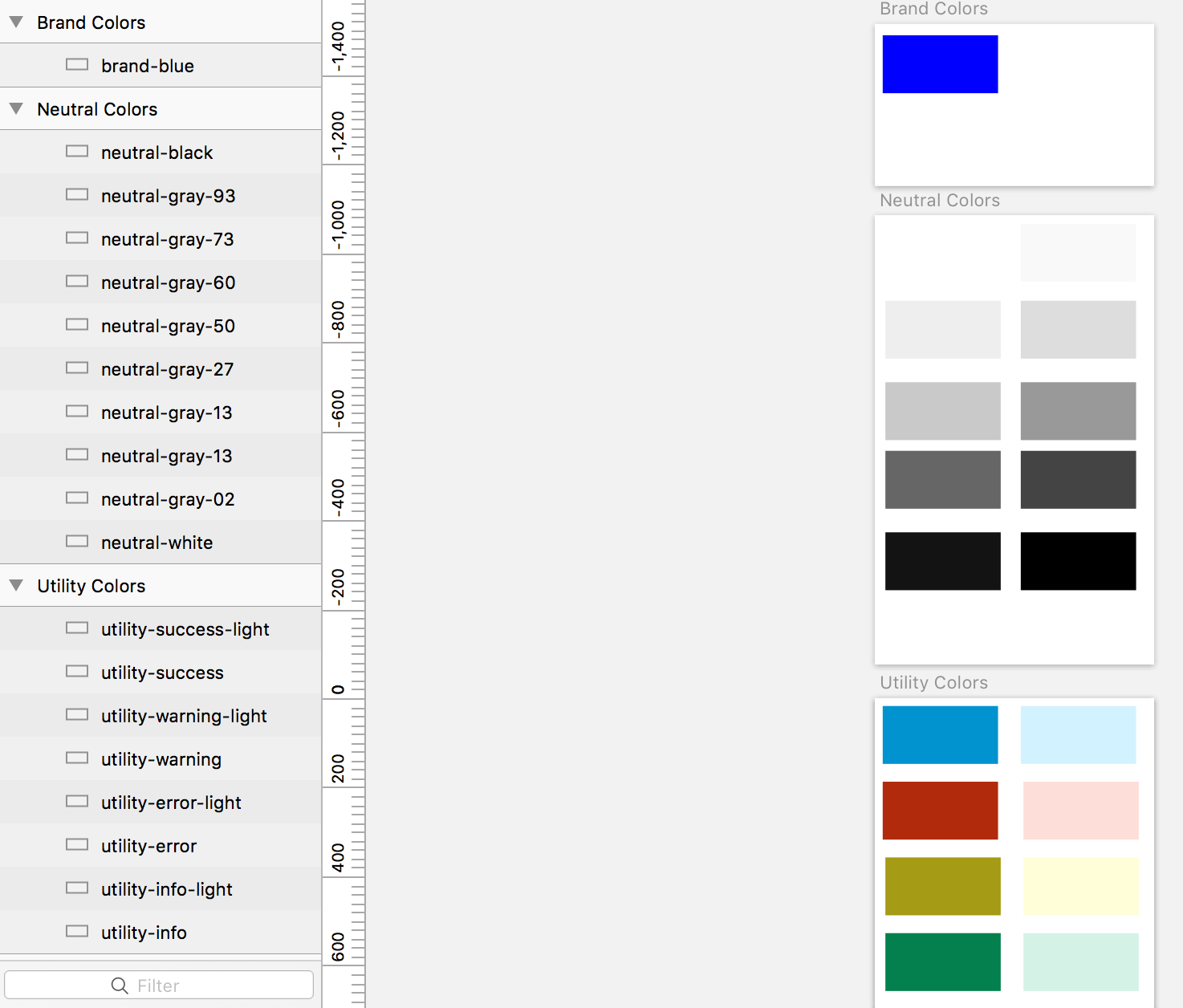
We’ll be focusing on colors in this demo. If you dive into colors of Sample Library, you should see a palette of colors similar to this:

These colors are produced by your Sketch file. In the top right of the DSM dashboard, there should be a little Sketch icon that says “Download The Plugin” if you hover over it.
Click that icon and CraftManager should download. Follow these directions:
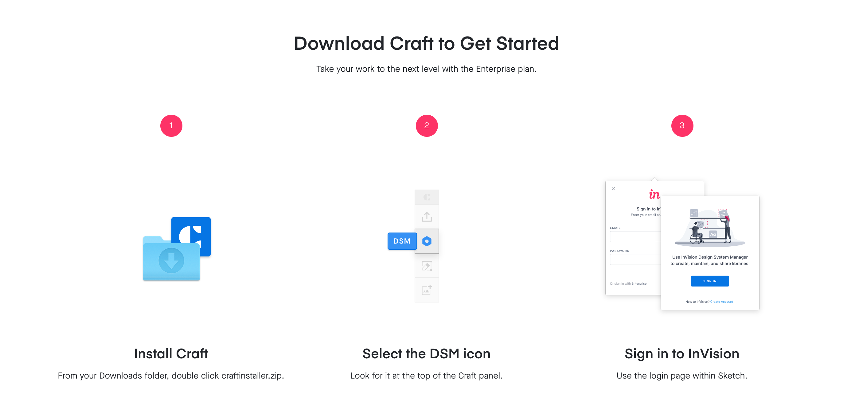
Once you get everything set up, learn the basics of how Sketch links to your DSM library.
Whew! I hope you are all still with me. Lots to set up, but well worth the time and effort. Now time for the magic of this.
Setting Up Sketch
Every designer has their own process and I’m not here to rock the boat. Here’s how I’m setting up my Sketch file with my colors:
I am adding swatches of colors that will be used (or potentially used) within the design system we are creating. I split colors up into 3 different artboards for organization, but you need at least 1 artboard for DSM to work. You don’t have to add colors with a palette of rectangles. You can add colors via comps if you’d like. This is straightforward to me, but may not be to you and your team which is quite alright.
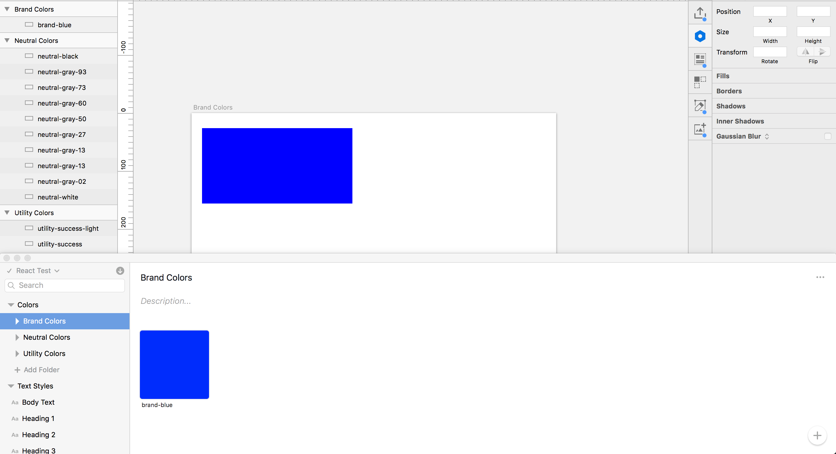
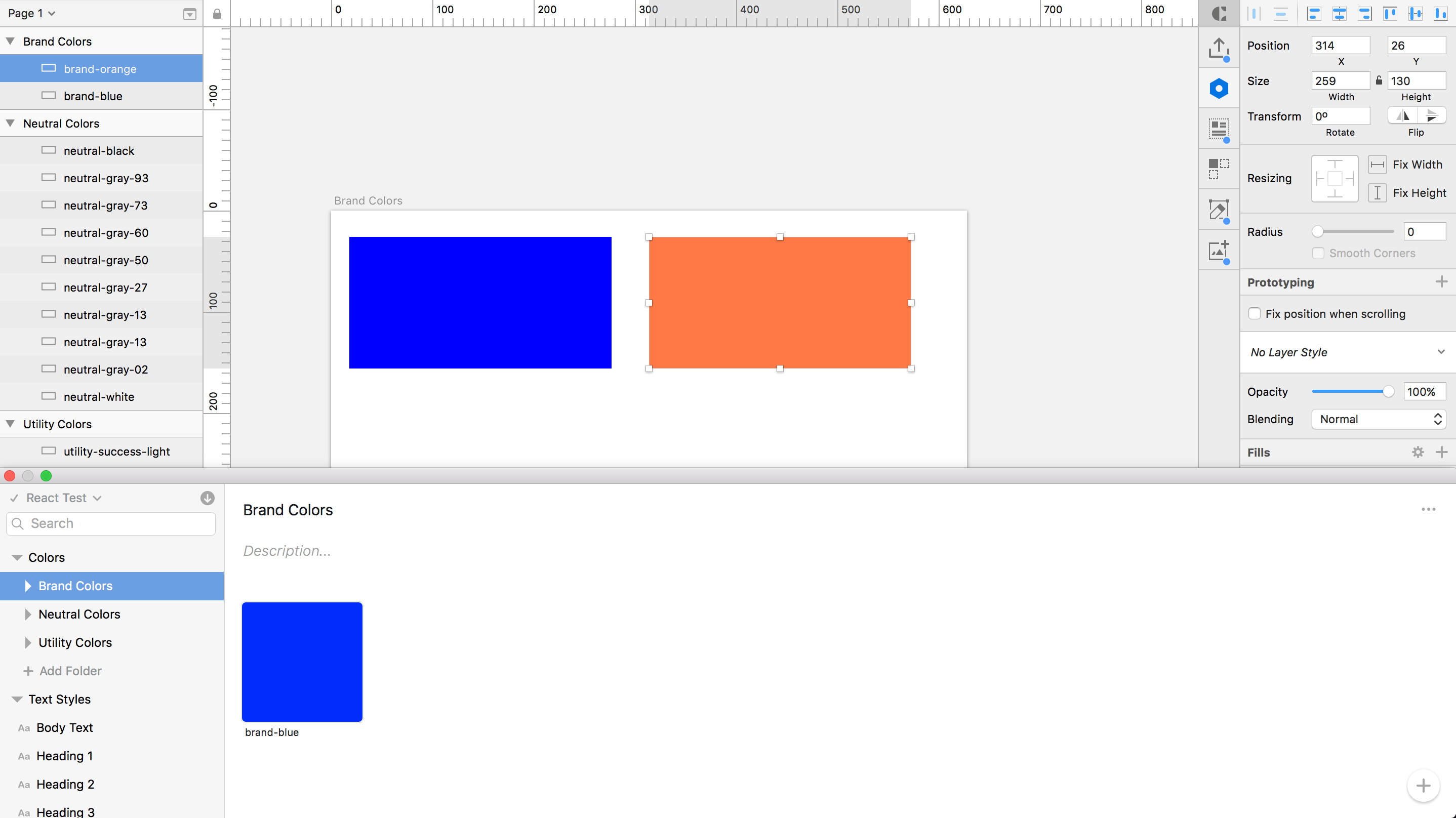
Let’s focus on the brand colors. I currently only have 1 in my project represented in both my local project and the DSM Sketch plugin.
Let’s add a second brand color by copying the blue rectangle, changing it to orange, and renaming it “brand orange.” The color names are important to synchronize within Sketch and the DSM library, since these names will help create the Sass variables used for your code. Here’s what it should look like:
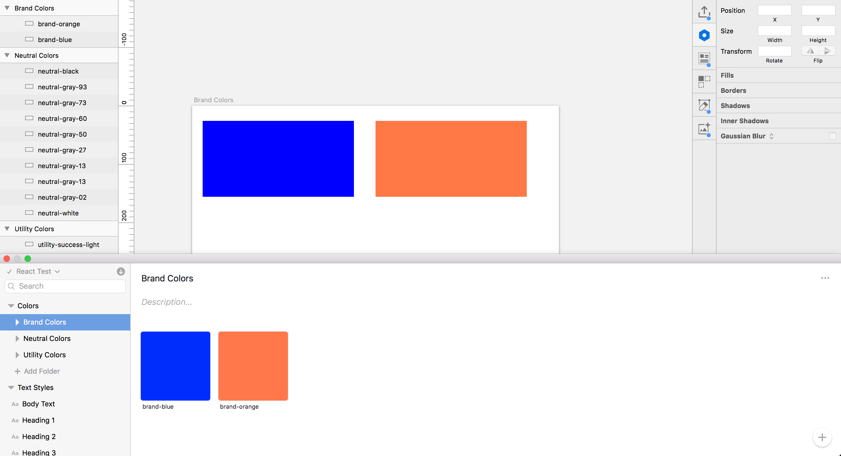
Make sure your orange color swatch is selected, then click the plus symbol in the DSM Sketch plugin. Choose the orange swatch in the popup window, and then click “Add Colors.” This will add the orange color to your DSM. Rename the “Untitled Color” to “brand-orange” to be consistent with what is in your local Sketch file.
Now that we have colors in our project, let’s check our DSM Library in the browser.
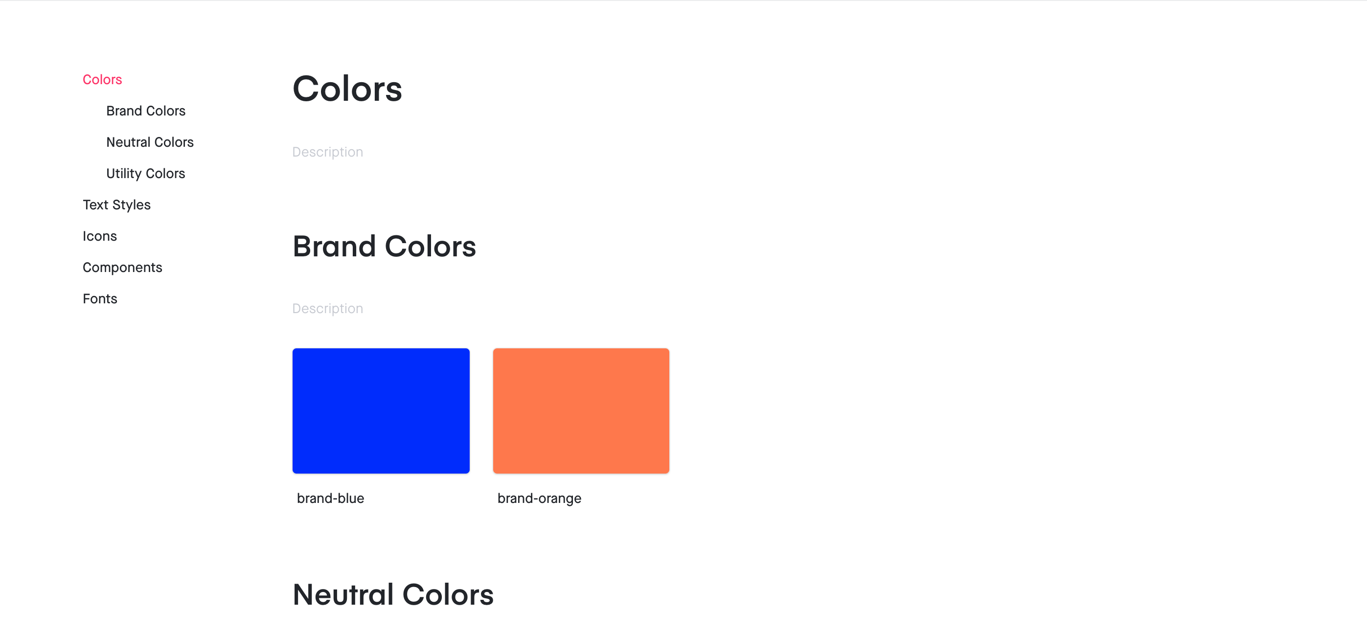
Impressive! Just like that we have our new color available in our library. These colors can now be used to update any Sketch file comps with the click of a button. Now for the really fun part of incorporating this into your code. Click on the “Design Tokens” icon link.
This will take you to the design tokens page with various options of how you can access your tokens. For this demo, we will focus on the Sass and JSON links on the left side. Let’s look at the JSON first.
Importing Design Token JSON Into React
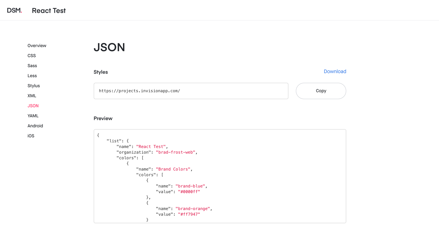
Look at that! Your tokens are automatically formatted in JSON. How do we get this data into our Storybook? There are various ways, but we are going to use Axios and JS promises.
Let’s take a look at our React project again. Let’s say I want to display our various colors with names. Create a Colors folder with a Colors.js file and a Colors.stories.js file (similar to Button). Install axios, a promise based HTTP client for the browser and node.js. Run npm install axios --save-dev to install this and add import axios from "axios"at the top of your Colors.js file. This will allow us to pull in the JSON data (since we can’t just add a simple import at the top).
import React, {Component} from "react";
import "../../css/styleguide.css";
import {Section} from "../Section/Section";
import axios from "axios";

export class Colors extends Component {
    state = {
	colors: []
    };

    componentDidMount() {
	axios
	.get(
	`https://projects.invisionapp.com/dsm-export/...the-rest-of-your-path-here`
	)
	.then(res => {
	const colors = res.data.list.colors;
		this.setState({colors});
	});
    }

    render() {
        ...
    }
}
In the code above, we have the initial state of colors being set to an empty array. Once the component mounts, axios gets the link where your JSON is being stored, then sets the array to the outermost colors array in the JSON file and sets the state. If we console.log(this.state.colors) it will output the array of color objects (for my project it prints out the array Brand Colors, Neutral Colors, and Utility Colors objects).
Now let’s take a look at what we want to render:
render() {
    return (
        <React.Fragment>
            {this.state.colors.map((color, index) => (
                <Section title={color.name} key={`section-${index}`}>
                    <ul className="sg-colors">
                        {color.colors.map((colorItem, index) => (
                            <li key={`color-${index}`}>
                                <span
                                   className="sg-swatch"
                                    style={{ backgroundColor: colorItem.value}}
                                />
                                <span className="sg-label">
                                   {colorItem.value}
                                <br /> {colorItem.name}
                                </span>
                            </li>
                        ))}
                    </ul>
                </Section>
            ))}
        </React.Fragment>
    );
}
We create a <React.Fragment> so that we can map through the color types. We then map through each color type array item’s colors (i.e. colors within Brand Colors), set the backgroundColor of each item’s <span> to the hex value, and then label the swatch. Once the colors array is done printing out to the Colors component, you get something that looks like this in Storybook:
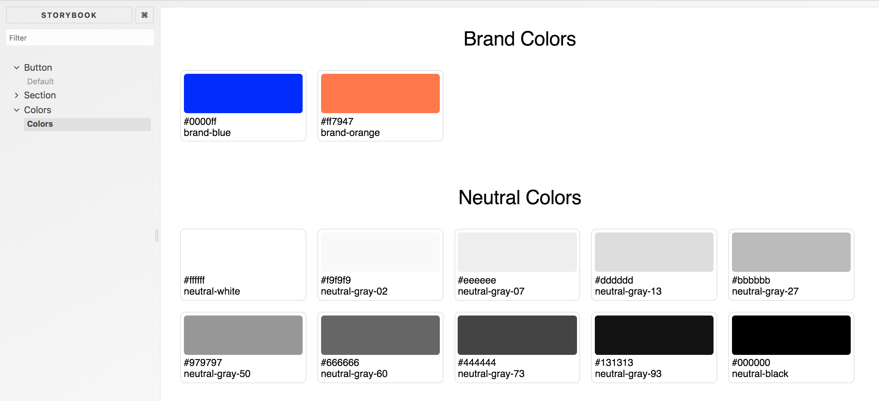
Would ya look at that! All of your colors from your DSM project are now represented in your style guide in Storybook. Now when you change any of those colors or add any colors in DSM, it will be represented in Storybook within the Colors story on refresh. Pretty cool, right? Well it gets cooler when we get into our Sass files.
Importing Design Token Sass Into React
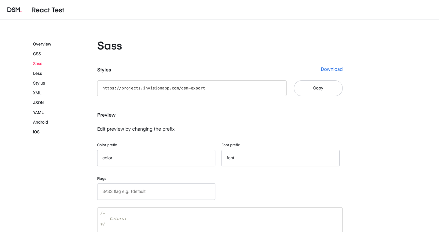
Sass generation is a bit different since we need this to filter through the entirety of the design system. Instead of using axios to use this, we’re going to add a webpack.config.js file to the .storybook folder. We’ll need the npm download package, so run npm install download --save-dev to download this. Within webpack.config.js, you should write something similar to this in order to download the file into /css/scss/abstracts:
const fs = require("fs");
const download = require("download");

download(
	"https://projects.invisionapp.com/dsm-export/...the-rest-of-your-path-here"
).then(data => {
	fs.writeFileSync("./src/css/scss/abstracts/_style-params.scss", data);
});
This will write your DSM Sass variables to whatever you want the file name to be in your SCSS. Let’s test it out with our button component. Go into button.scss in your components folder.
/*------------------------------------*\
    #BUTTON
\*------------------------------------*/

/**
 * 1) Button or link that has functionality to it
 */
.c-btn {
	background-color: #0000ff;
	padding: 1rem 2rem;
	color: #fff;
	font-size: 1rem;
	text-transform: uppercase;
	font-weight: bold;
	transition: background-color 0.2s ease;

	&:hover,
	&:focus {
		background-color: #ff7947;
	}
}
Let’s change the hex values to the Sass variables we created in style-params.scss and make sure to import your style-params.scss file into your style.scss file. Open a new tab in your terminal and compile your sass/watch for changes. Your new button.scss file should look like this.
/*------------------------------------*\
    #BUTTON
\*------------------------------------*/

/**
 * 1) Button or link that has functionality to it
 */
.c-btn {
	background-color: $color-brand-blue;
	padding: 1rem 2rem;
	color: $color-neutral-white;
	font-size: 1rem;
	text-transform: uppercase;
	font-weight: bold;
	transition: background-color 0.2s ease;

	&:hover,
	&:focus {
		background-color: $color-brand-orange;
	}
}
If you refresh storybook or re-run npm run storybook, your changes should take place and look something like this:
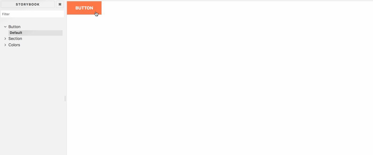
Hey! It worked! The background of the button is our `$color-brand-blue` and the hover state changes it to our `$color-brand-orange`. We have now officially connected our storybook to DSM.
Takeaways
The main takeaways from linking up DSM to Storybook:
- Designers and developers can be consistent with their styles in both design and dev environments. While this tool allows collaboration between devs and design, it also keeps these folks in the tools they are comfortable with.
- If a designer wants to update
$color-brand-blueto a lighter blue, they can easily do so by updating DSM and that will filter through to all elements in Storybook that contain$color-brand-blue. This works for changes to styles and additions to styles - We can dynamically add colors and other styles to our Storybook without having to manually add patterns.
- Other styles and assets like font sizes, heading styles, and icons can be connected in similar ways using the JSON and Sass exports from DSM.
- For this project we used Storybook as our React tool. The same process can be done in any other React project like Create React App for example.
While this works for me, I’m sure there are improvements to be made. I hope this helps you out or at least points you in the right direction! Thanks!