Brad Frost and I are happy to introduce to the world a new React-based Style Guide Guide, Gatsby Edition! Brad and I built the design system reference site boilerplate Style Guide Guide a year of so ago that used Jekyll and regular HTML, CSS, and Javascript to build it out. Because more and more companies seem to be turning to React for the base of their work (because it is the new hotness), we decided to build a clone of Style Guide Guide, but one that is built in React-based Gatsby and not Jekyll. Both of these style guide guides have been created from client projects that actually used this setup, which is pretty cool.
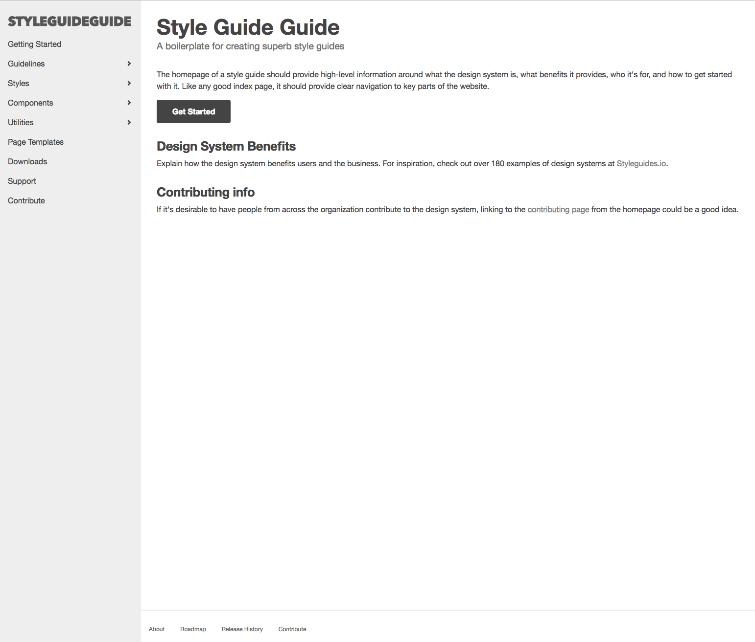 Style Guide Guide, Gatsby Edition gives a head start to companies or anyone to take what we built and use it for their own use to build out a storefront for the shiny patterns, guidelines, and principles that revolve around a design system. It also gives some good examples on where to find inspiration for the different sections of the Style Guide Guide, like accessibility for instance. It is intentionally built to have basic functionality and little style so that it can be reused by different companies to put their own brand and style on this.
While a design system should be a language agnostic platform, it doesn’t hurt to build the storefront of the design system in a way that represents the company and in a way that is easier to port over components from actual products that use this language. With a company that creates a bunch of React-based applications, this is probably a better option than the vanilla Style Guide Guide because it would be easier to port over components from a React-focused platform to another React-focused platform, rather than jumping through more hoops to get to that point. It is important, however, to always have some way to get regular HTML though, since the newest shiny thing will not always be React.
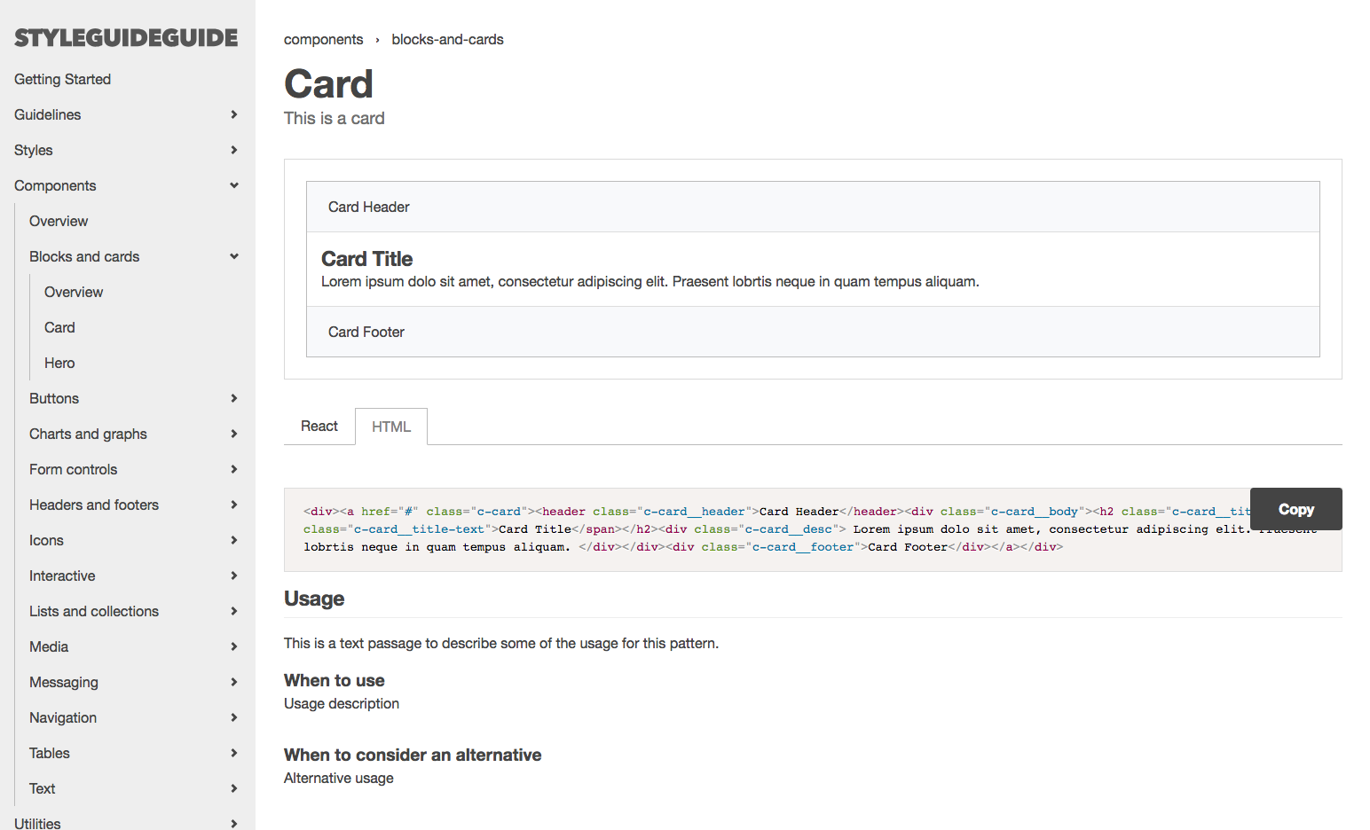
Similar to the vanilla version, this project uses Markdown files in the content folder to create the actual data that Gatsby sucks in. The components folder within the src folder houses the components that are being used to build Style Guide Guide. These are not the components that will get imported into the actual component detail page as variations (i.e. the Card page under Blocks and Cards) since we want a separation between the structure of this site and the design system that powers the company’s actual products. The examples live in ds-components, and then are sucked into ComponentExample in the src/components folder.
We tried our best to make it very similar to the Jekyll version in terms of structure to help learn how to use this quicker if you are familiar with the vanilla Style Guide Guide or Jekyll in general. There are some things that are still in flux that would be great to get help with:
- The components themselves could use a better way of being included (more dynamic way since it is pretty manual right now). Also, a flatter file may be better for importing from more workshop-like environments like Storybook.
- There is no iframe yet for the component example, so there isn’t the ability to resize this component based on the size of the iframe.
- Getting HTML and React code snippets formatting better (indentation, line breaks) and getting the actual component tag to show up in the React tab.
I’d say aside from the items in flux, the site is pretty much identical to the Jekyll site in terms of the main tasks of this product. I’m sure the great web community will find other issues and improvement suggestions as well, and that’s fantastic. We understand this is an MVP and can use some love. We hope this can help you and your teams with future design system work! Thanks for letting us share this with you all!
Personal Note
This project allowed me to embrace React more, dig in, and actually learn how to build these components with reusability in mind. If you are familiar with React, it is easy to get caught up in the context of a component rather than reusability. With reusability in mind, I was able to build components that on a page/template level was context based, but on a component level was more generic. With any newer product, there is some struggle, but in the end you start to get it and feel good about yourself for learning it. I am happy with the progress but I will continue to get my hands dirty with React until the newest hotness appears on the horizon. Thanks!