“I really like React, but I’m stuck writing code in Angular.”
“I know Vue really well, but I’ve been hearing about web components a lot lately. I’m not sure how to make that shift.”
You hear this a lot as a web developer as the new hottest framework comes out or the web community’s focus on “what is best” for design systems changes every several months it seems. For the past 4 years, we have felt these technology shifts in our own work and had to change our approach. As consultants, we work with various organizations to evaluate their design system efforts, make recommendations, and often collaborate with them to help implement their design systems using these recommendations. This means we have to adapt to the frameworks and tools they are using to build their systems and products. Because of this, I have helped build various design systems in a number of different frameworks, from straight up copy/paste vanilla HTML, CSS, and JS to React to Angular to web components. While these frameworks have different strengths, the common foundation between them is quite similar when it comes to creating a reusable UI component library
I recently created a simple cheatsheet for a colleague since she was familiar with React but not with web components. I wanted to expand it to showcase the common patterns for creating a design system’s component library across popular frameworks like React, Angular, Vue, and web components. Building design systems’ component functionality is usually pretty straightforward, so I find it helpful to examine the common conventions across these frameworks.
All of these frameworks can have similar component structure, component user APIs, properties, state management, methods/functions, lifecycles, and more. I wanted connect all of these frameworks to show how the same button would be written in React JavaScript (JS), React TypeScript (TS), Angular, Vue, LitElement (Web Components), and Stencil JS (Web Components) since I have helped build design systems in all of these. I don’t claim for this to be the end all be all, but it may help you save some time if you are learning a new framework. I highly suggest keeping up with the latest documentation with your framework of choice since these are always evolving.
Component Structure
The following shows how to structure a button component to achieve the same general result from a developer standpoint. The button will add a span with the words “is active” after the button is toggled. I’ve given some examples of:
- How to write the JS/TS wrapper whether it is a JS class-based component or a functional component in React.
- How props can be defined and used within each component in each framework.
- How internal state can be handled with
isActiveand how that plays out when toggling it betweentrueandfalsewith thetoggleIsActivefunction/method. Normally something likeisActivemaps to a HTMLclasschange on the component to show/hide content of components. In many design system components, the state is handled at a product level but the prop/state within the DS component should be able to update accordingly when the product-level code updates. - How to conditionally render content via a state/prop (e.g.
isActive) change
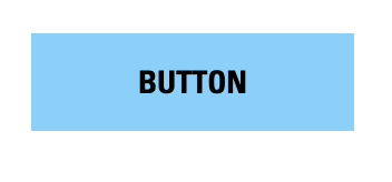
Here is a visual of the button example that I will be showing below in code. When the isActive prop/state is undefined or false:
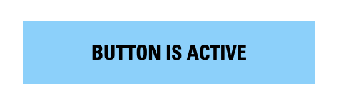
After clicking the button once, the isActive state/prop is toggled to true and the button now looks like this:
Now that you can see the behavior of the actual button, let’s dive into the component structure:
React JS
Within MyButton.js:
import React from 'react';
import PropTypes from 'prop-types';

function MyButton(props) {

  const [isActive, setIsActive] = useState(false);

  /**
   * Toggle isActive state
   */
  function toggleIsActive() {
    setIsActive(!isActive)
  }

  const {
    text
  } = props;

  return (
    <button className="button-class" onClick={toggleIsActive}>
      {text}

      {isActive === true && (
        <span className="button-is-active-text"> is active</span>
      )}
    </button>
  )
}

MyButton.propTypes = {
  /**
   * Button text
   */
  text: PropTypes.string,
};

export default MyButton;
React TS
Within MyButton.tsx:
import React from 'react';

export interface Props {
  /**
   * Button text
   */
  text?: string;
}

export const MyButton: React.FC<Props> = (props) => {

  /**
   * Initialize internal isActive state to false
   */
  const [isActive, setIsActive] = useState(false);

  /**
   * Toggle isActive state
   */
  function toggleIsActive() {
    setIsActive(!isActive)
  }

  return (
    <button className="button-class" onClick={toggleIsActive}>
      {text}

      {isActive === true && (
        <span className="button-is-active-text"> is active</span>
      )}
    </button>
  )
};
Angular
Within my-button.html:
<button class="button-class" (click)="toggleIsActive()">
  {{text}}
  <span class="button-is-active-text" *ngIf="isActive === true"> is active</span>
</button>
Within adjacent file my-button.ts (prefer to use templateURL: button.html within button.ts instead of embedded template literal to pull in HTML shown above):
import { Component, Input } from '@angular/core';

@Component({
  selector: 'my-button',
  templateUrl: './my-button.html',
})

export class MyButton {

  /**
   * Button text
   */
  @Input()
  text?: string;

  /**
   * isActive property to be toggled
   */
  @Input()
  isActive?: boolean;

  /**
   * Toggle isActive state
   */
  toggleIsActive() {
   this.isActive = !this.isActive;
  }

}
Vue
Within MyButton.vue:
<template>
  <button class="button-class" @click="toggleIsActive">
    {{ text }}
    <span class="button-is-active-text" v-if="isActive === true"> is active</span>
  </button>
</template>

<script>
export default {
  name: "my-button",

  props: {
   /**
    * Button text
    */
    text: {
      type: String,
    },
   /**
    * isActive property to be toggled
    */
    isActive: {
      type: Boolean,
    }
  }
  methods: {
  /**
   * Toggle isActive state
   */
    toggleIsActive() {
      this.isActive = !this.isActive;
    },
  },
};
</script>
LitElement (Web Components)
Within my-button.ts (unfortunately using && prints out “false” if the statement is not met, so we use a ternary):
import {html, LitElement} from 'lit';
import {customElement, property} from 'lit/decorators.js';

@customElement('my-button')
export class MyButton extends LitElement {

  /**
   * Button text
   */
  @property()
  text?: string;

  /**
   * isActive internal state
   */
  @state()
  isActive?: boolean;

  /**
   * Toggle isActive state
   */
  toggleIsActive() {
   this.isActive = !this.isActive;
  }

  render() {
    return html`
      <button class="button-class" @click=${this.toggleIsActive}>
        ${this.text}
        ${this.isActive === true
          ? html `<span class="button-is-active-text"> is active</span>`          : ""
        }
      </button>
    `;
  }
}
Stencil (Web Components)
Within my-button.tsx:
import { Component, Prop} from '@stencil/core';

@Component({
  tag: 'my-button'
})

export class MyButton {

  /**
   * Button text
   */
  @Prop() text: string;

  /**
   * isActive internal state
   */
  @State() isActive: boolean;


  /**
   * Toggle isActive state
   */
  @Listen('click')
  toggleIsActive() {
    this.isActive = !this.isActive;
  }


  render() {
      return (
        <button class="button-class">
          {this.text}
         {this.isActive && (
           <span class="button-is-active-text"> is active</span>         )}
        </button>
      );
    }
  }
}
Component Usage
To use these buttons above in another component, page, or in a product, you would include them as follows:
React JS
<MyButton text="Button" />React TS
<MyButton text="Button" />Angular
<my-button text="Button"></my-button>Vue
<my-button text="Button"></my-button>LitElement (Web Components)
<my-button text="Button"></my-button>Stencil (Web Components)
<my-button text="Button"></my-button>Children/Slots
Each framework allows you to create a component with a “slot” where you can throw arbitrary nested content or child components when the component is used. The children prop is used in React, ng-content is used in Angular, and slot is used in Vue, LitElement, and Stencil to carve out a place for content to render within the HTML this sits within. This is useful for components like a text passage that has generic h2 tags for headings in a CMS WYSIWYG editor. This is also useful for more composable components like cards where there can be various configurations of content within that component. Finally, this is a useful way of creating list like a link-list and child component link-list-item and creating a straightforward developer experience by nesting link-list-item within link-list so looping through data can be handled at the product level a lot easier rather than remapping arrays. Here is an example of a div component that wraps a “slot” for content to be placed when the component is being used:
React JS
Component Build in MyDiv.js
<div className="div-class">
  {children}
</div>
Usage
<MyDiv>
 <h3>Heading that renders within children slot</h3>
 <p>Heading that renders within children slot</h3>
</MyDiv>
React TS
Component Build in MyDiv.tsx
<div className="div-class">
  {children}
</div>
Usage
<MyDiv>
 <h3>Heading that renders within children slot</h3>
 <p>Heading that renders within children slot</h3>
</MyDiv>
Angular
Component Build in my-div.ts
<div class="div-class">
  <ng-content></ng-content>
</div>
Usage
<my-div>
 <h3>Heading that renders within children slot</h3>
 <p>Heading that renders within children slot</h3>
</my-div>
Vue
Component Build in MyDiv.vue
<div class="div-class">
  <slot></slot>
</div>
Usage
<my-div>
 <h3>Heading that renders within children slot</h3>
 <p>Heading that renders within children slot</h3>
</my-div>
LitElement (Web Components)
Build in my-div.ts
<div class="div-class">
  <slot></slot>
</div>
Usage
<my-div>
 <h3>Heading that renders within children slot</h3>
 <p>Heading that renders within children slot</h3>
</my-div>
Stencil (Web Components)
Build in my-div.tsx
<div class="div-class">
  <slot />
</div>
Usage
<my-div>
 <h3>Heading that renders within children slot</h3>
 <p>Heading that renders within children slot</h3>
</my-div>
Lifecycle Hooks
Each framework shares similarities with running designated lifecycle hooks before render, after the component renders, and when the component updates. While this isn’t an extensive list, it shows the similarities between frameworks. To read more on lifecycle hooks:
- React Lifecycle Hooks
- Angular Lifecycle Hooks
- Vue Lifecycle Hooks
- LitElement Lifecycle Hooks
- Stencil Lifecycle Hooks
React JS
useEffect(() => {
   // Used to adjust props or run functions on component update or component mount

      return () => {
        // Run when the component unmounts
      };
  }, []);

const ref = usRef(); // Allows a user to set ref.current to access the HTML node of the component.
React TS
useEffect(() => {
   // Used to adjust props or run functions on component update or component mount

      return () => {
        // Run when the component unmounts
      };
  }, []);

const ref = usRef(); // Allows a user to set ref.current to access the DOM HTML node of the component.
Angular
ngOnInit() {
  // Initialization of the component before it is in view/mounted
}

ngAfterViewInit() {
  // Run on after the component mounts. Allows you to access DOM nodes then
}

ngAfterContentInit() {
  // Run after the component and children are mounted and in view
}

ngOnDestroy() {
  // Run when the component unmounts
}

ngOnChanges() {
 // Run when state or another part of the component changes
}
Vue
beforeMount() {
  // Initialization of the component before it is in view/mounted
}

mounted() {
  // Run on after the component mounts. Allows you to access DOM nodes then
}

beforeUnmount() {
  // Run when the component unmounts
}

unmounted() {
  // Run when the component is fully unmounted
}

beforeUpdate() {
 // Run when state or another part of the component changes, but before DOM is changed
}

updated() {
 // Run when state or another part of the component changes but after DOM is changed
}
LitElement (Web Components)
constructor () {
  super();
  // Needed when using connected or disconnected callbacks
}

connectedCallback() {
  super.connectedCallback();
  // Initialization of the component before it is in view/mounted
}

disconnectedCallback() {
  super.disconnectedCallback();

  // Run when the component unmounts
}

firstUpdated() {
   // Run after the component mounts/updates to access the DOM
 }

updated() {
  // Run when state or another part of the component changes but after DOM is changed
}
Stencil (Web Components)
componentWillLoad() {
  // Initialization of the component before it is in view/mounted
}

componentDidLoad() {
 // Run on after the component mounts. Allows you to access DOM nodes then
}

componentWillUpdate() {
  // Before updating

componentDidUpdate() {
  // Run after the component updates
}

componentDidUnload() {
  //Run when the component unmounts
}
Loops
Within design system components or at the application level, it is important to loop through list items of an array or object. Here’s how to do that within each framework:
React JS
In the return() of your MyList.js component (make sure items is declared as a prop):
<ul className="list-class">
  {items.map((item, index) => {
    return (
      <li
        className="list-item-class"
        key={`list-item-${index}`}
       >
         {item.text}
       </li>
    );
   })}
</ul>
React TS
In the return() of your MyList.js component (make sure items declared is a prop):
<ul className="list-class">
  {items.map((item, index) => {
    return (
      <li
        className="list-item-class"
        key={`list-item-${index}`}
       >
         {item.text}
       </li>
    );
   })}
</ul>
Angular
Directly in my-list.html component:
<ul class="list-class">
  <li class="list-item-class" *ngFor="let item of items">
    {{ item.text }}
  <li>
</ul>
Vue
Within the <template> section of the MyList.js component:
<ul class="list-class">
  <li class="list-item-class" v-for="item in items" >
    {{ item.text }}
  <li>
</ul>
LitElement (Web Components)
Within the return() of the my-list.tsx component:
<ul class="list-class">
  ${this.items.map((item: any) => {
    return html`<li class="list-item-class">
      ${ item.text }
    <li>`
  })}
</ul>
Stencil (Web Components)
Within the return() of the my-list.tsx component:
<ul class="list-class">
 {this.items.map((item) =>
    <li class="list-item-class">
      { item.text }
    <li>
  )}
</ul>
Conditionals
If/Else statements are an essential part of component builds when it comes to rendering different content or aesthetic in a component. Conditionals can be added to the render function itself (best for simple prop content toggling) or outside of the render function in a simple if/else statement (best for rendering significant component content changes). In the above examples, I’ve included conditionals in the render function, but let’s explain that concept in a bit more detail:
React JS
In the return() of your MyButton.js component (make sure items is declared as a prop):
// Simple show this if true statement
{isActive === true && (
  <span className="button-is-active-text"> is active</span>
)}

// Ternary - If active is true, do what's after the question mark. Otherwise print what's after the colon.
{isActive === true ? (
    <span className="button-is-active-text"> is active</span>
  )
: (
  <span className="button-not-active-text"> is not active</span>
  )
}
React TS
In the return() of your MyButton.js component (make sure items declared is a prop):
// Simple show this if true statement
{isActive === true && (
  <span className="button-is-active-text"> is active</span>
)}

// Ternary - If active is true, do what's after the question mark. Otherwise print what's after the colon.
{isActive === true ? (
    <span className="button-is-active-text"> is active</span>
  )
: (
  <span className="button-not-active-text"> is not active</span>
  )
}
Angular
Directly in my-button.html component:
// Simple show this if true statement
<span class="button-is-active-text" *ngIf="isActive === true"> is active</span>

// Angular If/Else Syntax - If active print the first span. Otherwise print the span marked with
#notActiveBlock.
<span class="button-is-active-text" *ngIf="isActive === true; else notActiveBlock"> is active</span>
<span class="button-not-active-text" #notActiveBlock> is not active</span>
Vue
Within the <template> section of the MyButton.js component:
// Simple show this if true statement
<span class="button-is-active-text" v-if="isActive === true"> is active</span>

// Vue If/Else Syntax - If active print the first span. Otherwise print the span marked with
v-else.
<span class="button-is-active-text" v-if="isActive === true"> is active</span>
<span class="button-not-active-text" v-else> is not active</span>
LitElement (Web Components)
Within the return() of the my-button.tsx component (Only use ternaries. Using && returns false to the screen if the conditional is not met):
// Ternary - If active is true, do what's after the question mark. Otherwise print what's after the colon.
${this.isActive === true ?
    html`<span class="button-is-active-text"> is active</span>`
: ""
}
Stencil (Web Components)
Within the return() of the my-button.tsx component:
// Simple turn on if true statement
{this.isActive && (
  <span class="button-is-active-text"> is active</span>
)}

// Ternary - If active is true, do what's after the question mark. Otherwise print what's after the colon.
{this.isActive === true ? (
    <span class="button-is-active-text"> is active</span>
  )
: (
  <span class="button-not-active-text"> is not active</span>
  )
}
Dynamic Tags or Efficient Different Renders
Some components are strictly a <div> but then there are other components that need dynamic tags like a heading tag or button that needs to also look like a button, but render an <a> tag. While I know the button/link renders tend to be a controversial subject, here’s an example of how you could do that:
React JS
In MyButton.js:
// One of the props we called href in our React component. Make sure to define it.
const MyTag = href ? 'a' : 'button';

return(
<MyTag className="button-class" onClick={toggleActive}>
   {text}

   {isActive === true && (
     <span className="button-is-active-text"> is active</span>
   )}
</MyTag>
)
React TS
In MyButton.tsx:
// One of the props we called href in our React component. Make sure to define it.
const MyTag = href ? 'a' : 'button';

return(
<MyTag className="button-class" onClick={toggleActive}>
   {text}

   {isActive === true && (
     <span className="button-is-active-text"> is active</span>
   )}
</MyTag>
)
Angular
Directly in my-button.html component, we use the Angular-specific syntax *ngIf statement to render an a tag if the href is provided and button tag if it isn’t. ng-container and ng-template allow us to define the contents of the my-button component once so that we leave no room for missing additional props or contents as this component evolves.
<a class="button-class"
  *ngIf="href; else button"
>
  <ng-container *ngTemplateOutlet="myButtonContents"></ng-container>
</a>
<ng-template #button>
  <button class="button-class>
    <ng-container *ngTemplateOutlet="myButtonContents"></ng-container>
  </button>
</ng-template>
<ng-template #myButtonContents>
  {{ text }}
  <span class="button-is-active-text" *ngIf="isActive === true"> is active</span>
</ng-template>
Vue
Within the <template> section of the MyButton.js component you use the Vue component syntax with Vue’s :is attribute to conditionally render the tag:
<component :is="href ? 'a' : 'button'" class="button-class" :href="href">
  {{ text }}
  <span class="button-is-active-text" v-if="isActive === true"> is active</span>
</component>
LitElement (Web Components)
Within the my-button.tsx component (unfortunately LitElement doesn’t like dynamic tags):
render() {
  if (this.href) {
    return html`
      <a href="${this.href}" class="button-class" @click=${this.toggleIsActive>
        ${this.text}
        ${this.isActive === true
          ? html `<span class="button-is-active-text"> is active</span>`
          : ""
        }
      </a>
    `;
  }
  else {
    return html`
      <button class="button-class" @click=${this.toggleIsActive>
        ${this.text}
        ${this.isActive === true
          ? html `<span class="button-is-active-text"> is active</span>`
          : ""
        }
      </button>
    `;
  }
}
Stencil (Web Components)
Within my-button.tsx:
render() {
  if (this.href) {
    return (
      <a href={this.href} class="button-class">
        {this.text}
        {this.isActive && (
          <span class="button-is-active-text"> is active</span>
        )}
      </a>
    );
  }
  else {
    return (
     <button class="button-class">
       {this.text}
       {this.isActive && (
         <span class="button-is-active-text"> is active</span>
       )}
      </button>
    );
  }
}
In Conclusion
So there you have it. While each framework has its own conventions and syntax, it’s fairly straightforward to implement common patterns when creating design system component libraries. Once again, I’m not creating the cheatsheet for all developers who want/have to learn a new framework, but my hope is that these examples can help developers making a transition to a new framework a little easier. While these aren’t the only ways to render children or use a conditional, they are examples that have worked for me in my own projects. Please make sure to read the documentation on the framework websites though and don’t work through this stuff blindly. I hope this helps anyone making the switch or figuring out how to write code as new frameworks continue to come out of the woodwork. At the end of the day, HTML, CSS, and JS are the common thread across these frameworks. Happy coding!